·By Nick Lane-Smith
Do they just have massive animation teams?
A teardown of Anthropic's Cowork launch video, with a 20-year motion graphics veteran.
- teardown
- motion-graphics
- product
Anthropic ships launch videos this fast because they've built a reusable design system. They're also obsessive about storytelling.
I got the question from a founder on r/startups: how do OpenAI and Anthropic ship product videos this polished, this fast? Nobody in the thread had a real answer. The guesses ran from giant in-house animation teams to some screencasting tool the rest of us are missing, and the top one, "in-house brand people plus freelancers," is what you say when you're guessing.
My brother and co-founder Matt spent twenty years doing motion graphics and VFX for Fortune 500 brands, including agency work on Apple, Google, and Microsoft projects. So I sat him down, played Anthropic's 69-second Claude Cowork launch video, and made him narrate what we were looking at, frame by frame.
What he found: no massive team, an expensive part that's the design rather than the animation, and about fifty to a hundred thousand dollars to have these 69 seconds built from scratch.
Mocked UI controls your attention
The video is obviously animated and not a direct screen recording, which is what makes it interesting. None of the UI in it is real. Anthropic had a shipping product they could have recorded, cleaned up, and dressed with the usual zooms and highlight rings. Instead they rebuilt a simplified version of their interface from scratch, and that one decision does most of the work.
Record your real product and you inherit everything on screen, all the nav and chrome that has nothing to do with what you're demoing. So you zoom in, add a highlight ring, drag a fake cursor around, and make the viewer hunt for the point while you apologize for it with annotations.
When a new user lands on your site or scrolls past you in a feed, their attention is a rare commodity. One swipe, one click, and they're gone forever. Your job as a marketer is to strip back everything that isn't essential, put the most important point front and center, and focus them on the one thing you're trying to get across in that moment. Do that with a screen capture or screenshots and you're fighting yourself.
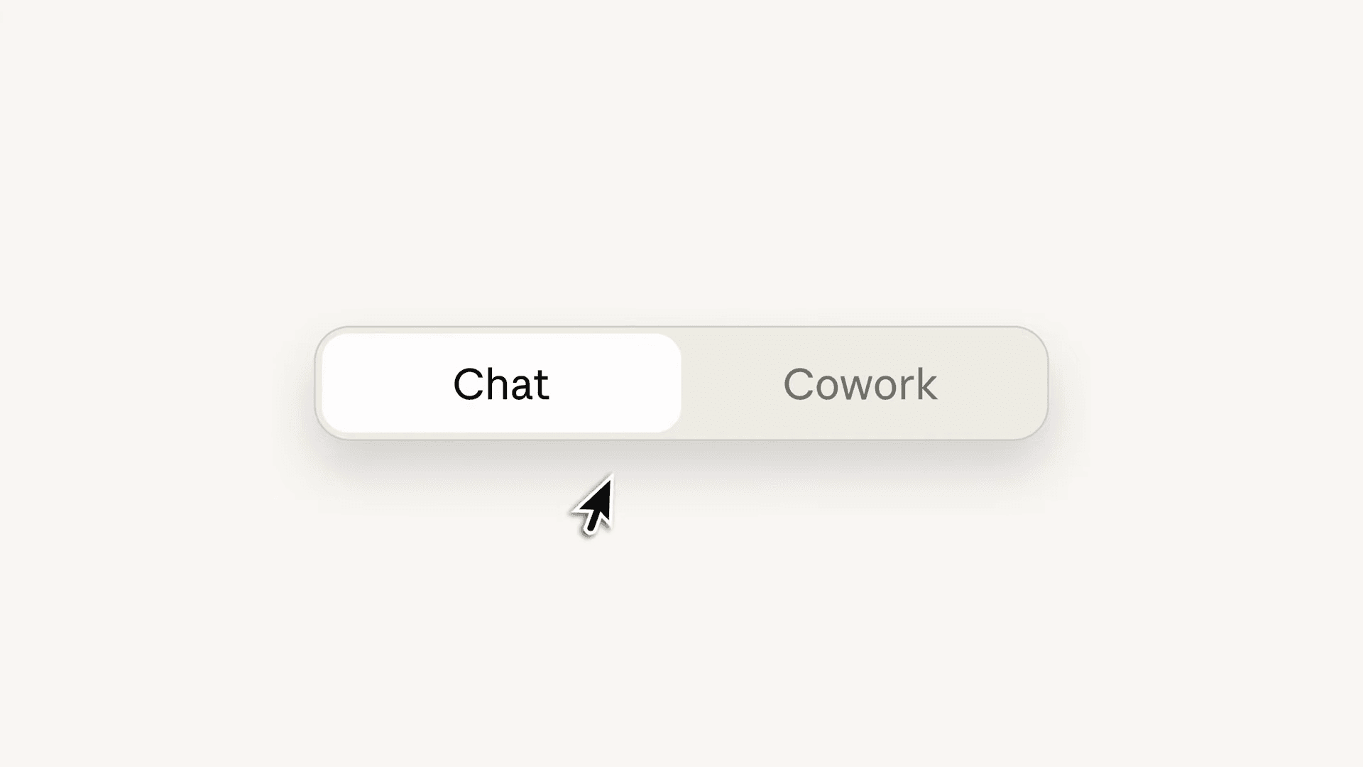
Watch how the video opens. A cursor slides onto a single pill that says Chat, and a second pill, Cowork, appears beside it. That two-way toggle does one job: it tells you there's a new mode worth noticing. It's the simplest possible way to say "there's another option," and the point is unmistakable because nothing else on screen competes with it.
The file browser later in the video is the opposite move. It's a full, convincing macOS Finder window, not an abstraction, but when it opens the only thing that animates is the files dropping in, so your eye goes straight to them and skips past the window around them. Here's Matt on that beat:
"When this page opens up, the only things that animate on are the files. It draws your attention there."
The cursor as a character
My favorite thing in the teardown is something you probably didn't consciously notice: the cursor. In most product videos it moves like a robot, straight line, shortest path, click. This one behaves differently: when a button appears, the cursor turns toward it before it moves, takes a curved and slightly playful path, and pauses a beat before each click, like a person deciding.
When I pointed at it the only word I had was "cute." Matt was more precise:
"It feels bespoke animated. The way it turns to look at it and then curves up, it's becoming a character."
I asked what the brief for that even looks like. How do you tell an animator to do that?
"They said: make it react. It turns as the thing pops out, then zips over to it. It's surprised."
Someone designed an emotional arc for a mouse pointer. There's no voiceover or music in this video, so the cursor is doing the narrating, and it's brilliant.
Off-the-shelf tools, expensive choices
The type treatment is what first caught my attention. The words slide in with weight and intention, and it reads as expensive. So I asked him: is this sitting in some template pack I could buy?
His answer was better than a simple yes or no. He read the moves straight off the screen:
"These are just After Effects text animators. A Y offset on the block as it slides in, the words moving in on X and fading up, a subtle tracking change as it settles."
So the tools are off the shelf, the same After Effects text animators every motion designer has had for twenty years. The design choices are not: which easing curve to use, how much to stagger, how to nudge the tracking so the line feels like a human made it. That's what separates this footage from a template you could buy, and it's nearly invisible. They've applied real design taste to every single moment, every single movement.
The price of 69 seconds
Back to the Reddit question, where Matt got concrete. I asked him: if I described this video to you, how long to make it from scratch? Remember he's built this exact kind of work for two decades. His answer was about half a week to "shoot your shot and vibe it out," meaning his best single take with a style frame per scene. Not the finished thing. The finished thing, he's sure, had a room of designers litigating what happens when X happens, for every X.
His core point reframed the whole video for me:
"The implementation isn't actually that difficult. Designing all these moves, what happens where, blank slate to this UI, that's the hard bit."
The keyframes are nearly free, the decisions are what you're paying for. Anthropic ships videos like this fast because the expensive decisions were already made: one brand mark doing five jobs, one accent color, one card vocabulary. Every new video spends from that account instead of starting from zero.
And if you don't have the account? I asked what it would cost to commission this exact video from a top motion studio like Brand New School, where Matt has worked on Google projects:
"They would charge you so much money it would blow your mind. Probably a hundred grand."
A hundred grand for sixty-nine seconds. The ideas and the taste are cheap, plenty of teams have both. You pay for the decisions, and the hours to execute them.
What you can learn
You don't need a hundred grand to copy what works here. Find the one thing your user actually cares about, put it front and center, and cut everything else.
"Perfection is achieved, not when there is nothing more to add, but when there is nothing left to take away."
The same goes for a marketing video. Every extra thing you put in front of the viewer gives them another reason to swipe away, so take things out: the distracting element, the bit of UI drifting by in the background, the panel that was never the point. Strip it down to the pure essence of what you want to land.
We were watching a different product team's attempt at this same kind of video, everything on screen moving at once, and I called it kinetic slop. Motion for the sake of motion, animation for the sake of animation, done because you can and not because you should. Here's Matt on the difference:
"Everything is moving, and it's like, well, what's the intent? And the intent is the bit that's actually interesting in high-end design pieces."
There's a second lesson, the one that actually answers "and so fast?" Decide your system once, the mark, the color, the component vocabulary, so the second video costs a fraction of the first.
The hundred-grand gap between having taste and having this video on your site is the thing we spend our days on, but that's a post for another day.
We pull apart high-end motion work like this regularly, beat by beat. If there's a video you want us to break down, get in touch.